O-Wind
A two-week competition by Dyson to create a visual identity for the O-Wind: a multi-directional wind turbine.
-
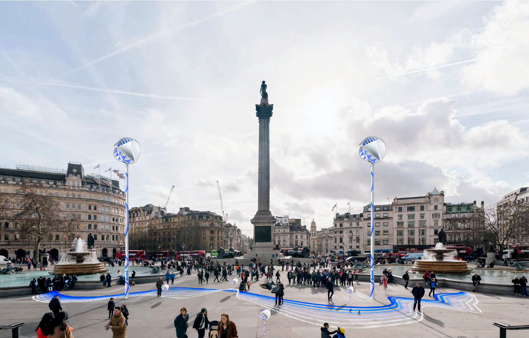
To develop the visual identity for O-Wind, our team focused on creating a design that would be effective both on the turbine itself and across various media platforms. We aimed to maximise engagement and drive users to the online portal. The client emphasised highlighting the turbine's unique multi-directional capabilities, which we conveyed through animations and graphical elements. These elements were incorporated into our photography to visually demonstrate the technology's versatility.
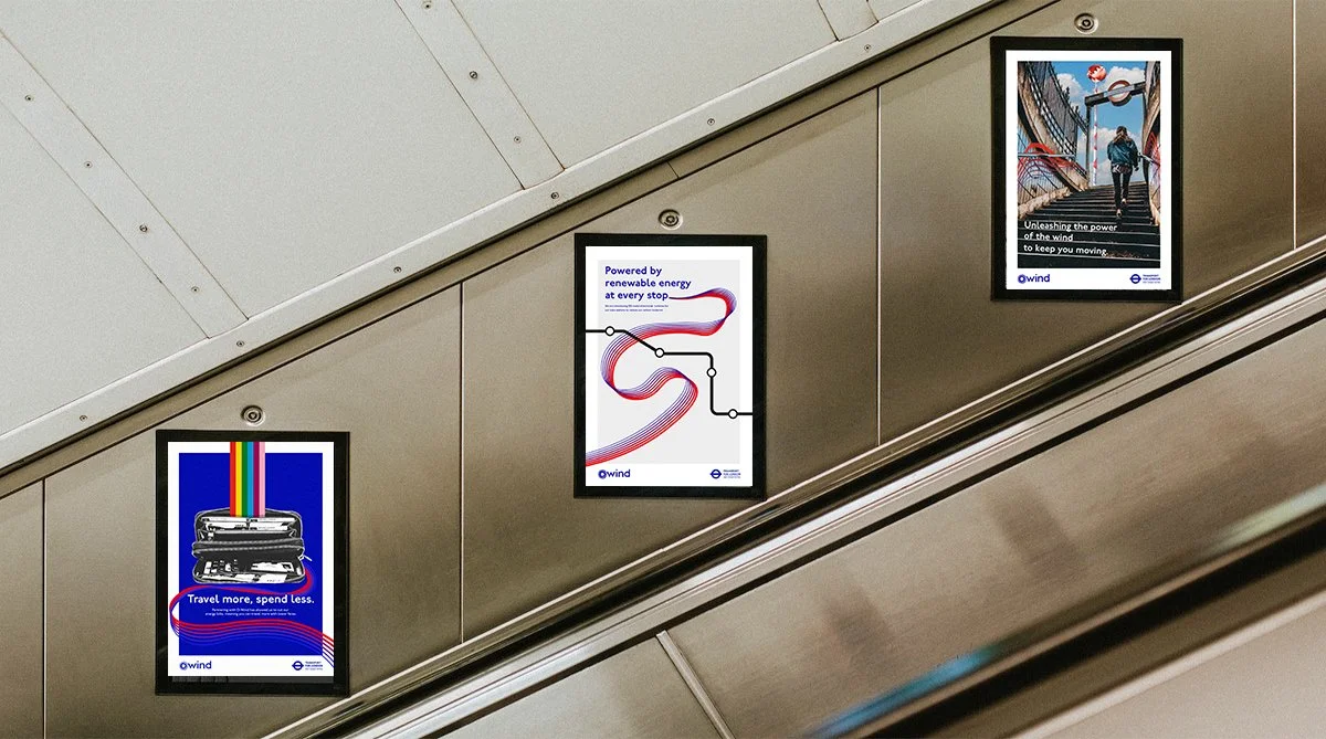
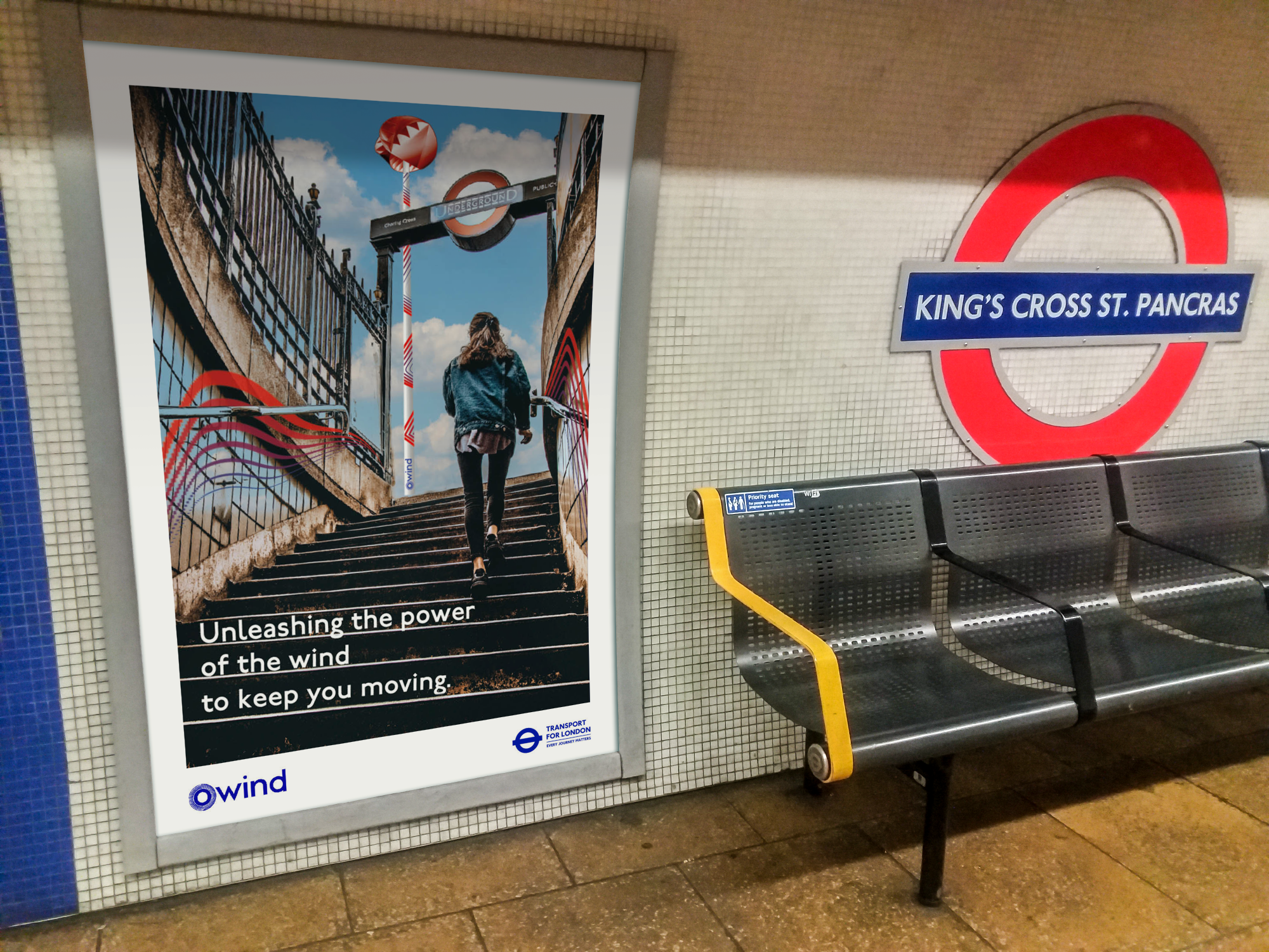
Our out-of-home (OOH) campaign introduced the O-Wind, showcasing its benefits through clear and engaging messaging. A QR code was included to direct viewers to the online portal, providing additional details. We made sure the messaging was accessible, ensuring that the complex technology was presented in a way that resonated with everyday users, emphasising its practical benefits.
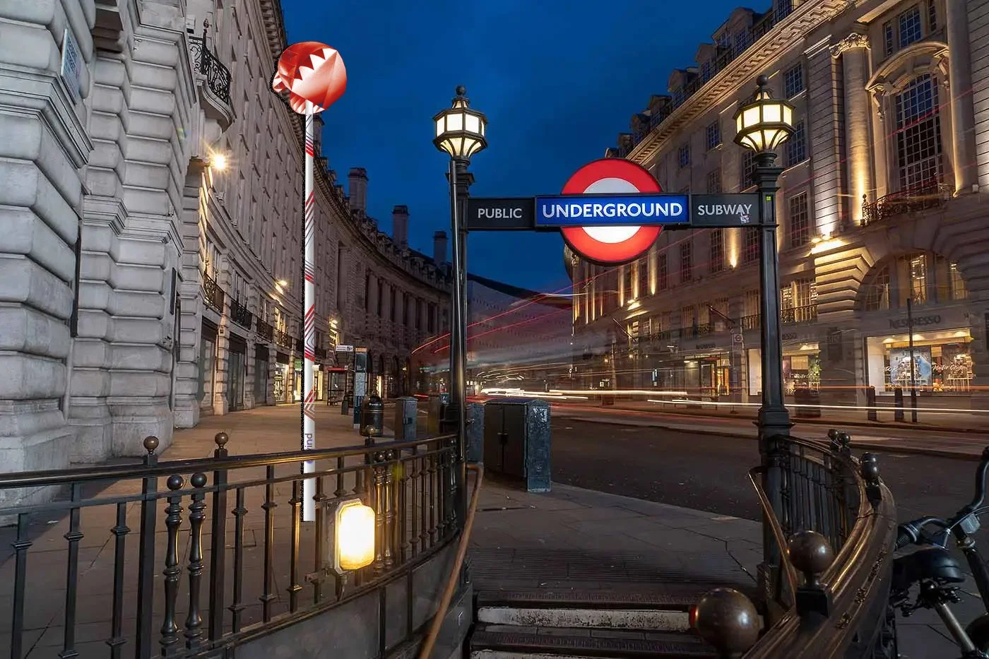
Furthermore, we explored potential sponsorship opportunities, selecting the London Underground as a case study. The campaign positioned O-Wind as a solution to power the underground system, highlighting its energy-saving potential and the possibility of reducing tube fares. This partnership angle not only demonstrated the practical applications of O-Wind but also provided a compelling narrative for potential sponsors.
Discipline
Advertising (OOH), Branding
Competition Brief by
Dyson - Creative Challenge
Group Project with
Savoy O’Connor, Gabriele Mercado, Mehera Kalantari, Fortune Aduroja
Suggested Third Party Sponsor
How the O-Wind brand would change if TFL sponsored it


